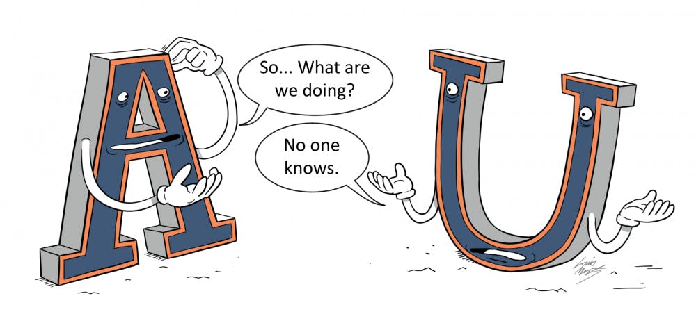
Over the last three months, the size of two letters have become very important to the Auburn community.
People have been asking questions about the proportions of an “A” and how it should relate to a “U”.
Is the new “A” too wide?
What if we also squished the “U”?
Do we really need to get rid of those little white triangles at the top?
Why can’t the University just leave the logo alone?
Alternatively, why are so many people making a big deal out of this?
Journalists, in the last three months, have been forced to find unique ways to describe a slight change to a minute detail of one of Auburn’s logos.
Through all of this, there has not been a clear statement from the University about the origin, time-frame or complete cost of this logo change.
As of publication, here is the known chain of events that have culminated in the current logo situation.
At some point before December 2018, University officials discussed the possibilty of updating Auburn’s AU logo.
We know this, because in December 2018, a group of SGA members met with the administration to discuss changing the logo.
Then, there was relative silence about the subject until Brandon Marcello of Auburn Undercover leaked the new logo design and tweeted a side-by-side comparison with the old logo.
In response, the University issued a statement saying that this was not a new logo, but a part of updating the school’s “identity system to make it more compatible with the many ways we use it and to elevate the Auburn brand.”
At the beginning of this fall semester, the new logo began to show up in the Brown-Kopel Student Achievement Center and Horton-Hardgrave Hall, the two newest facilities opened on campus.
On Oct. 7, the SGA Senate debated and passed a resolution requesting an update on where the University stood in implementing the logo.
At the following week’s SGA meeting, SGA President Mary Margaret Turton announced that Ronald Burgess, Auburn University’s chief operating officer, told her that the University would not be changing its logo.
Then, last week, Preston Sparks, director of university communications services, told The Plainsman on behalf of Auburn that the University had “postponed implementation of the AU logo” to allow for more discussion with “stakeholders.”
Finally, The Plainsman learned that the University has paid at least $30,000 to Chermayeff & Geismar & Haviv, a well-known design firm in New York.
Up until now, most of the journalistic and public discussion has been focused on the logo change itself, but in focusing too strictly on the slight design difference between the two logos, we lose sight of the bigger problem.
It’s not the size of the letters that should matter; but rather how few words the University has used to properly communicate its decisions with the community.
Clear and intentional communication is one of the most vital roles of a modern university.
There are tens of thousands of students on campus who trust Auburn to educate them, and over 5,000 faculty and staff members who rely on Auburn for employment.
That doesn't include the uncountable number of businesses that sell Auburn merchandise or the school’s alumni and fans who expect the University to be honest and forthcoming.
All of these people, to some extent, need Auburn to communicate transparently and effectively, but right now, they aren’t.
We still don’t know who in the administration spearheaded the logo redesign, what the original timeline for implementation would be or what that plan will look like going forward.
The University has said they are postponing the logo’s implementation so they can have more time to dialogue with “stakeholders,” but we don’t know which stakeholders they intend to talk with or what these dialogues will look like.
More importantly, we don’t know why the University has struggled so much to effectively communicate their answers to these relatively straightforward questions.
Auburn has a lot of important issues on its horizon.
We have a president to hire, a potential enrollment cap being debated and diversity enrollment numbers that continue to trend downwards.
Not to say that this logo debacle doesn’t matter, but its impact is limited.
This has, however, shown that the University has problems with communication.
Auburn Family “stakeholders” deserve honest and forthcoming communication — not mixed messages that come from jargon-laced press releases.
This editorial is the majority opinion of the Editorial Board and is the official opinion of the newspaper.
Do you like this story? The Plainsman doesn't accept money from tuition or student fees, and we don't charge a subscription fee. But you can donate to support The Plainsman.